
You must log in or register to comment.
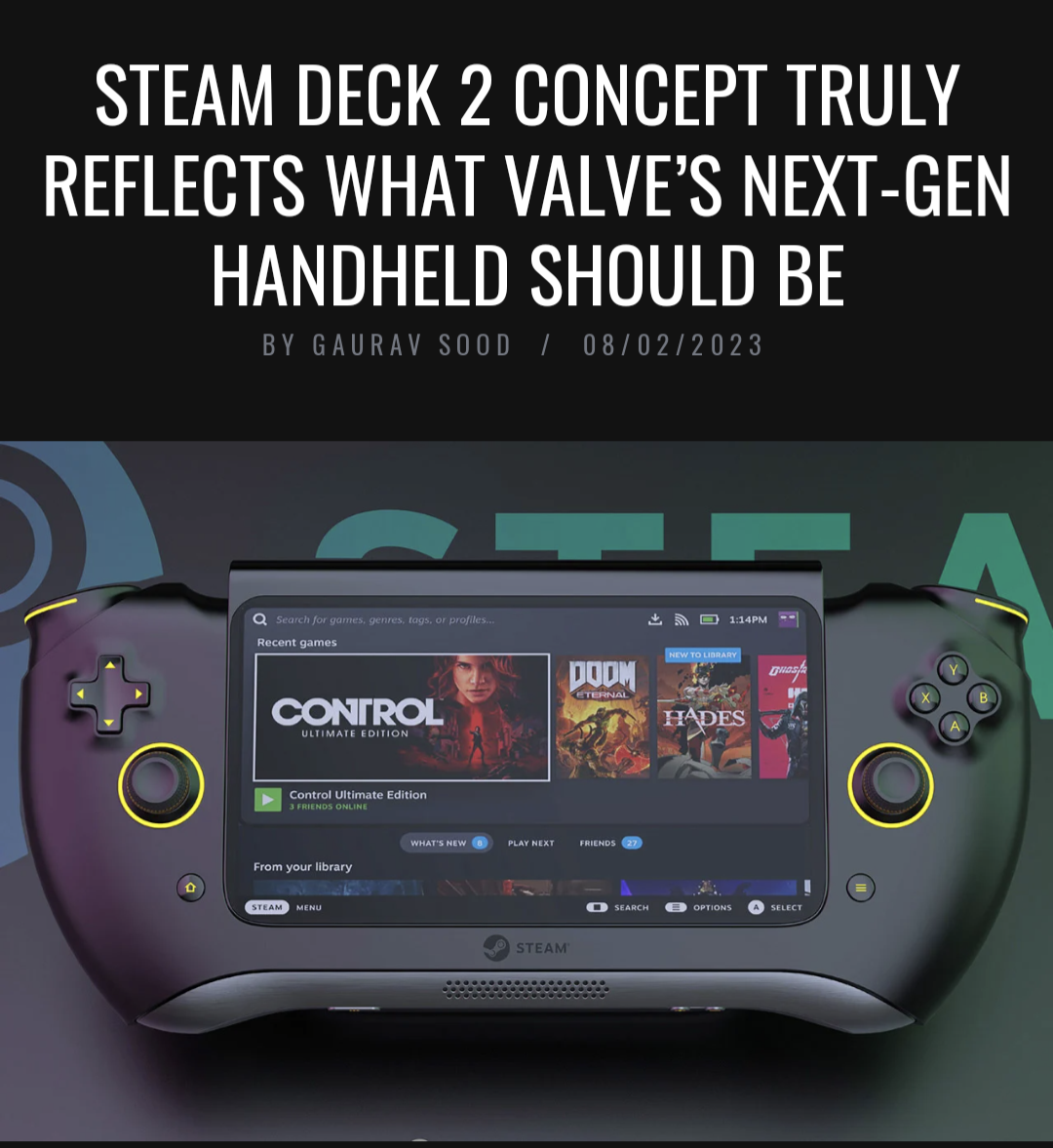
Missing the track pads, total garbage.
I agree. The article claims this mockup has better “trackpads”, but I think they’re just referring to the thumbsticks.
Nah, I think the article and the image are both AI generated, so the “author” of the article really has no idea what the image actually looks like.
The article could be, but the images definitely aren’t.
I only ever use them in desktop mode but I know if they disappeared I’d be mad about it
Y’all need to look into radial menus. Will change your life.
Ragebait
I am almost positive the Steam Deck 2 will be the same design with upgraded hardware, maybe additional USB port or something.
Valve put a lot of RND into the Decks design and ergonomics. I think it would be a waste of money to change it. Money i would rather them use towards an OLED screen or something.
Yeah, I’m expecting the same. Maybe some exhaust differences with newer heatsink tech.
Improving on things isn’t a waste of money especially if they’re successful enough to achieve the main goal, ie. make games more accessible to more devices, instead of making the perfect handheld (which is unlikely for a first iteration). The body is too big for the screen, too heavy, new SOC means new considerations internally like cooling and battery, keeping the current form is arguably more stupid since it will probably limit actual improvements.
That concept art is ugly though.
I disagree. I think Valves current form factor for the deck is as iconic as the DualShock or the Xbox controller. They don’t need to change anything externally other than the display, we don’t even need it to be higher resolution, just a good OLED panel, which would probably introduce a screen with less of a bezel. better GPU/CPU would make it almost perfect.
This design is dumber than that one rounded boomerang ps3 prototype controller
At least the boomerang curved into your palms. This literally curves away. The only part of your body that will be holding onto this “prototype” when you use its joysticks are the tips of your fingers.
From what I’ve read, the boomerangs ps3 controller wasn’t actually dumb at all. It was apparently extremely comfortable to hold because of the way it curved into your palms and the placement of the buttons and sticks felt really natural. But the poor reception to the look of it basically bullied Sony into reverting to the classic DualShock layout.
Concepts are always made by the people I least want to actually be in charge of design
Part of the problem is that concept art needs to be flashy to be noticed, but most usability focused designs are plain or very similar to existing designs.
I’m so happy they don’t actually get to design anything
Actually maybe one of them did ouya
What kind of prank is the artist trying to pull?
Sweet mercy that’s ugly
holy shit this thing is ugly

Rounded corners on the screen? Yuck
That’s probably the least disgusting feature of them all, kinda looking forward for a monitor with rounded corners even though I know the problems that it will carry. The inverted shape of the handles though…
Don’t worry, its just a concept design from Carota. Zero chance this gets out the door.
Shit looks AI generated lmao, totally unusable shape lmao.
Getting serious Wutang controller vibes.
Maybe unpopular but I kinda like the design and the aluminium looking bottom line… but it’s still dumb and not repairable like this. Also, we just want the old one with a better screen.
Looks like a game gear