

I’d have to go with the wood grain Atari 2600, I’m a sucker for 70’s designed electronics.

Intelligang represent!
Intellevision may not have the best controller design out there, but the versatility with the different card inserts made playing games easier when I was a kid. Basically a guide in the palm of your hands for each game you owned. Losing them did blow however.
BAM THERE IT IS !!!
We had both this one and the 2nd gen gray one! Plus the voice synthesizer addon. My dad would replace the touch pad inserts so we didn’t have to buy new controllers.
Amazing console way ahead of it’s time.
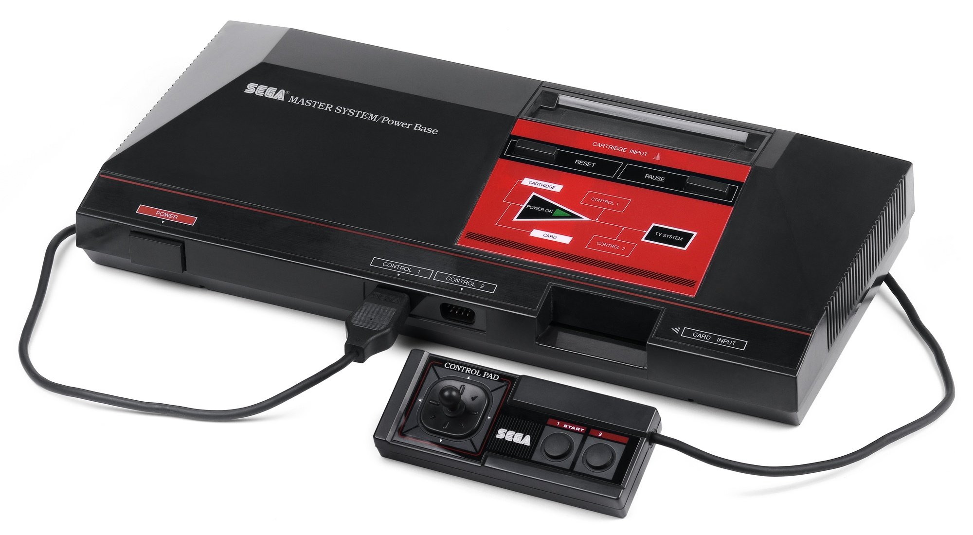
I never understood the choice to put a flowchart on the front of this one. 😆
Very sciencey, not a toy. Hilariously, Nintendo fought hard to get their competing “Entertainment System” recognized as a toy and not a computer, for import tax purposes.

Game Boy Advance. Actually all 3 variants (GBA, SP & Micro) are beautiful consoles.
I love how the SP looks. The original feels better in the hand but the clamshell looks so good and it feels great to open and close.
I’m tempted to get a foldable as my next phone because I miss that design.
The 2600 depicted in the article thumbnail, was absolutely a beauty in its native environment of the late 1970’s:
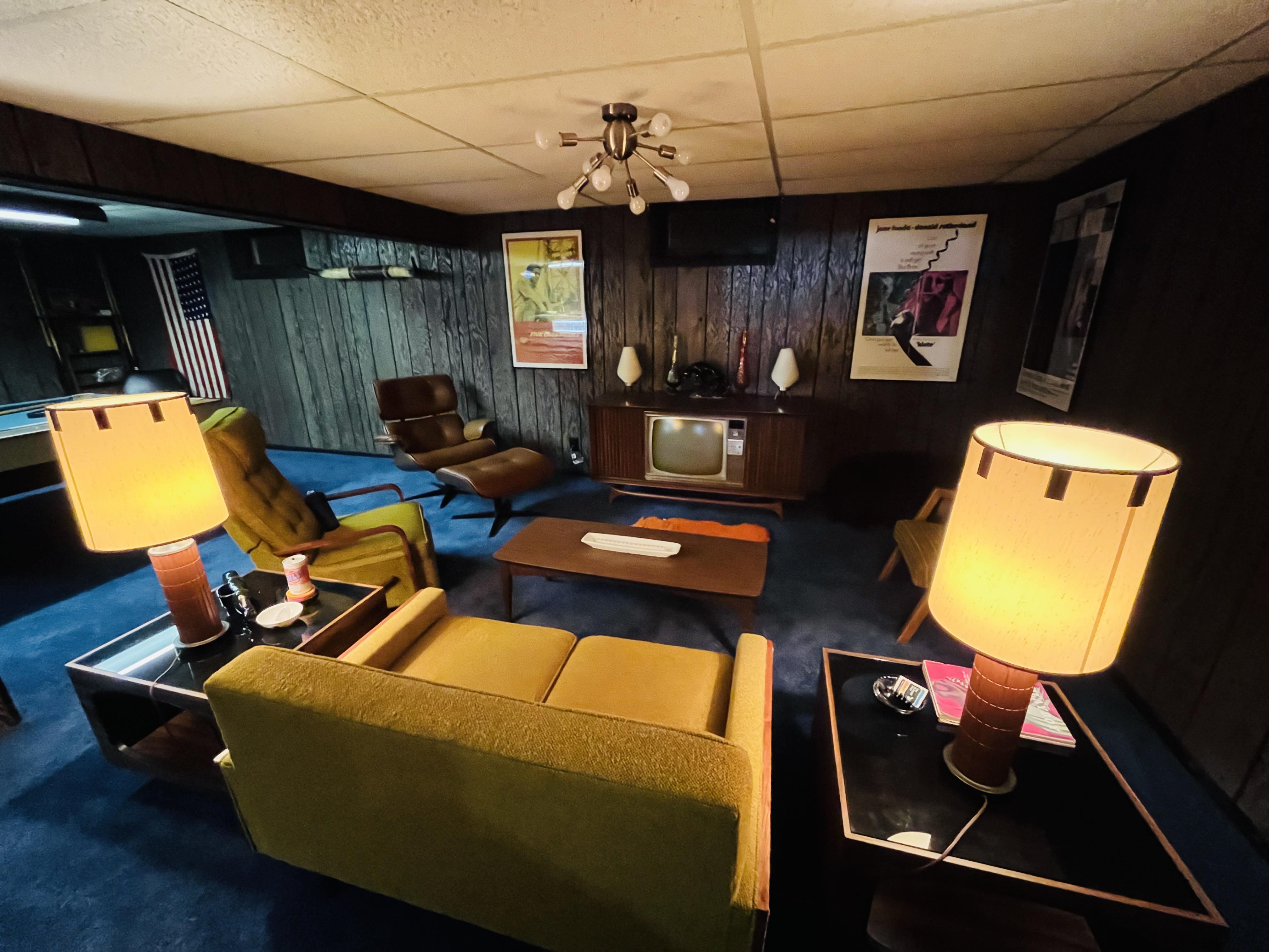
How many consoles look like toilets?
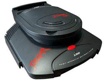
While I definitely agree the overall best design goes to the Atari 2600, this comes in close second for me:
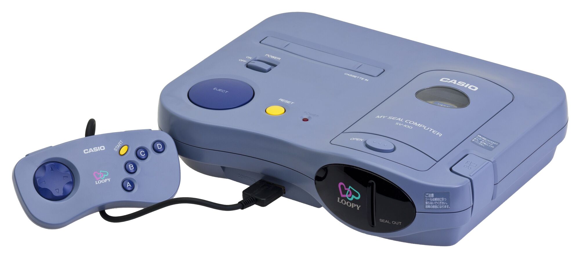
This bad boy (or girl, rather) is the Casio Loopy. Yes, Casio, the company primarily known for making wristwatches. This console was only released in Japan, and when it launched it had a target demographic of girls and young women. The console came with a built-in sticker printer, and the games were woman-targeted games in genres like romance, fashion, and life simulation (like Animal Crossing). Only 10 games were ever made for the Loopy, by the way. Its biggest failure and reason for not selling well was being a console that had games that looked like the SNES but having to directly compete with the PS1 and N64, as well as the replaceable sticker cartridges being very expensive.
Now, I am a man, and I am clearly not a part of the target demographic of this console. The games are entirely uninteresting to me, except maybe the Animal Crossing-like game “I Want A Room In Loopy Town.” But something about the curved shape of the console and its cool purple hue speak to me. The black cover for the sticker ejection port has me imagining a newer version playing an animated logo on that part if a small screen was behind it. The absurdly massive Eject button just looks like it gives the most satisfying “kerchunk” when you press it to eject a cartridge.
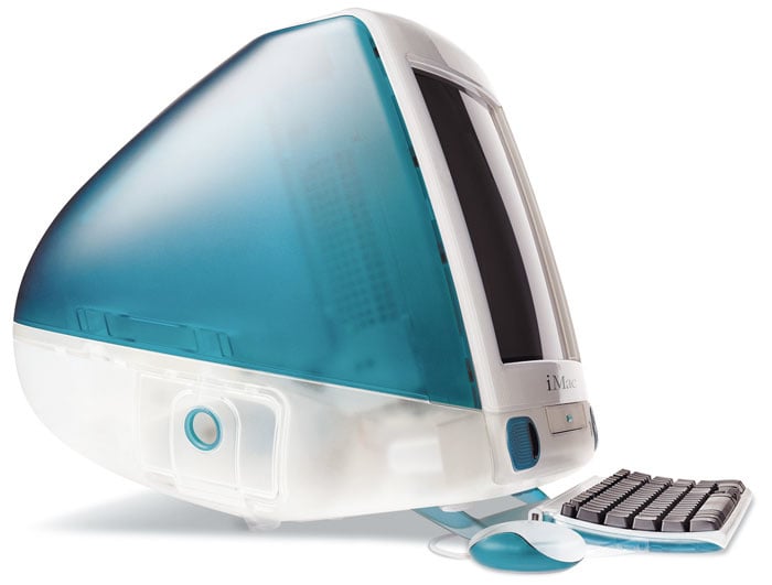
In third place I’d have to give a shout out to the Apple iMac G3, even though I really dislike Apple products and its neither a game console.or made for gaming in general, something about the white and bold color combo just looks really cool. The mouse was really bad though. Got a bit of that Frutiger Aero look.

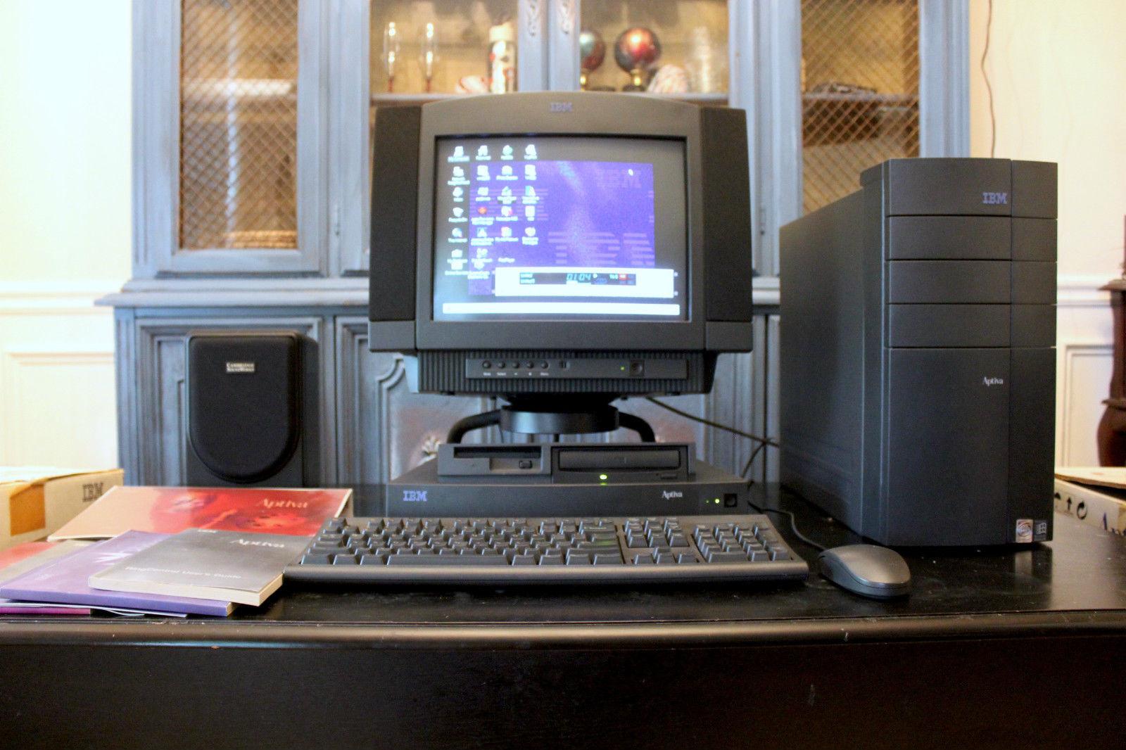
I got my start with atari 2600 but I think the GameCube was the best looking in both form and function. Best looking computer is an IBM Aptiva S
Is PS Vita a retro console? If so that.
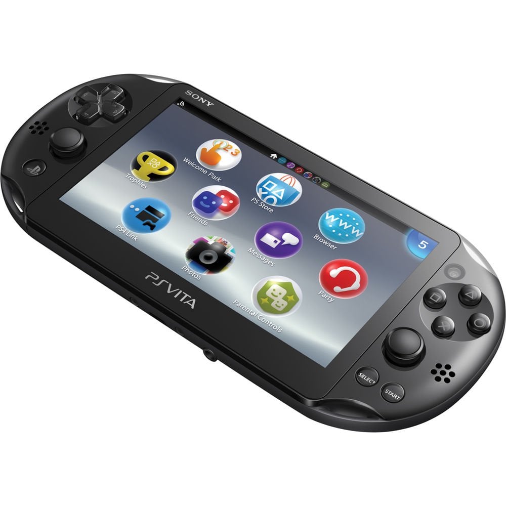
I’d say PSP is, but Vita isn’t. DS is, but 3DS isn’t.
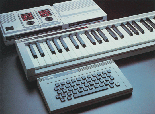
Why does there have to be just one? So many consoles are awesomely designed and reflect their eras well. I’m partial to colecovision and the Intellivision II. The redesign of the intellivision had an entire suite of peripherals to match the new design, including a musical keyboard.
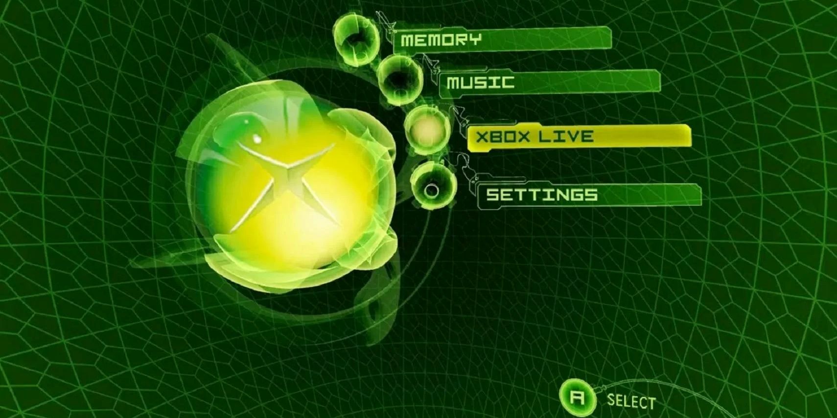
while not necessarily the prettiest console by any means but i always thought the Og xbox home menu went way harder than it needed to, now that’s presentation!
The Mega Drive is the best looking retro console, I mean look at it

PS2 slim deserves a mention, I feel.
PS2 slim is now retro
👵 ➡ 💀
NGL, that fine-wood version of the Atari looked so slick. Too bad I only got the cheap plastic one.
the atari 2600 looks like it could take you back to the future with enough jigawatts